
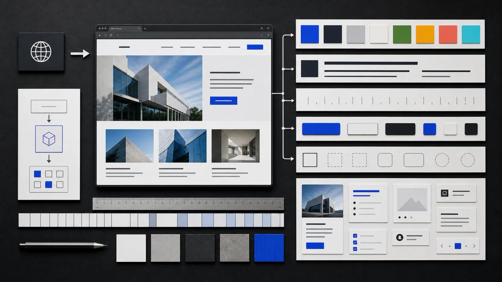
A website is the rendered result of many design decisions: colors, type, spacing, grids, radii, borders, shadows, imagery, motion, and component behavior. Converting a URL into a design system means recovering those decisions and organizing them into rules that can be reused.
The result should not be a forensic dump of every computed CSS value. Production sites contain one-off overrides, third-party widgets, experiments, and legacy styles. A design system is a deliberate reduction: the smallest coherent set of rules that explains most of the interface.
Capture more than one page state
Start with representative evidence. Capture the homepage, one content-heavy page, one conversion page, and any authenticated product surface that matters. Include desktop and mobile views, plus interactive states such as open navigation, hover, focus, validation, or selected tabs.
- Use full-page captures to understand page rhythm and section sequencing.
- Use viewport captures to compare hierarchy at a consistent scale.
- Record the source URL and viewport size for each image.
- Separate global patterns from campaign-specific art direction.
Turn raw colors into semantic roles
A color picker may find dozens of values. The useful task is identifying what each color does. Group near-duplicates, then name the roles that appear consistently.
- Canvas and elevated surface colors.
- Primary, secondary, and muted text.
- Borders, dividers, and disabled states.
- Primary action and interactive accent.
- Success, warning, error, and informational feedback.
Check contrast before reusing the palette. A screenshot can reveal appearance but not guarantee accessible text and control states.
Identify the typography system
Detected font names are only the beginning. Document the jobs assigned to type: display, heading, body, label, metadata, code, and numeric data. Record approximate size, weight, line height, and usage rather than copying every isolated value.
- Display face and fallback stack.
- Body face and readable line length.
- Heading scale and breakpoint changes.
- Label, caption, and metadata treatment.
- Weight, line-height, and letter-spacing conventions.
Recover spacing and layout rules
Measure repeated gaps between related elements. Most sites reveal a base spacing rhythm even when individual values vary. Look for recurring card padding, grid gaps, section spacing, navigation height, and container width.
Record relationships as well as numbers: card padding is smaller than grid gap; section spacing is larger than component spacing; mobile gutters stay stable while columns collapse.
Inventory components and their states
List repeated interface objects and define their anatomy. A button is not only a rectangle with a color. It has size, label style, icon placement, hover, focus, disabled, loading, and destructive states.
- Navigation and mobile menu.
- Primary, secondary, quiet, and icon buttons.
- Inputs, selects, checkboxes, validation, and help text.
- Cards, tables, tabs, accordions, alerts, and modals.
- Empty, loading, error, and success states.
Express the result as tokens
:root {
  --color-canvas: #f7f7f5;
  --color-surface: #ffffff;
  --color-text: #111214;
  --color-text-muted: #6b6d72;
  --color-border: #dedfe2;
  --color-accent: #2740f0;

  --font-display: "Example Sans", system-ui, sans-serif;
  --font-body: "Example Sans", system-ui, sans-serif;

  --space-1: 0.25rem;
  --space-2: 0.5rem;
  --space-3: 0.75rem;
  --space-4: 1rem;
  --space-6: 1.5rem;
  --space-8: 2rem;

  --radius-control: 0.375rem;
  --radius-card: 0.5rem;
  --container-page: 75rem;
}
Validate the system by rebuilding one section
Use the extracted tokens to recreate a representative section. If the output feels wrong, do not immediately add more values. Check whether a semantic role is missing, whether the typography scale is inaccurate, or whether the layout relationship was misunderstood.
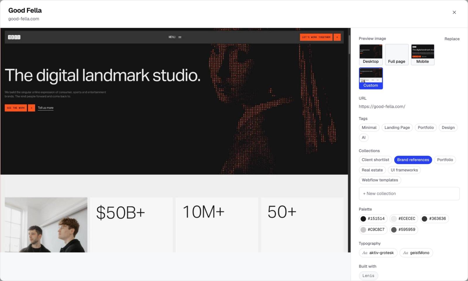
Moodmark stores a website as a visual reference with its source, screenshots, palette, detected fonts, tags, notes, and technology hints. That makes it easier to move from a URL to a reusable brief instead of losing the analysis in separate files.
Questions & answers
Can you generate a design system from any URL?
You can infer a useful visual system from most accessible rendered pages, but authentication, dynamic states, embedded widgets, and inconsistent legacy styles may require additional screenshots and manual judgment.
Is a list of website colors a design system?
No. A design system assigns colors semantic roles, combines them with typography, spacing, layout, components, states, and usage rules, and validates that they work together.
How do I extract fonts from a website?
Inspect loaded font files and computed styles, then document how each family, weight, size, and line height is used. Detection should be followed by a typography-role audit.
Should extracted design tokens copy the original website exactly?
Use extraction to understand and document a reference. For a new brand or product, reinterpret the system and replace proprietary identity, content, and assets rather than cloning them.
