
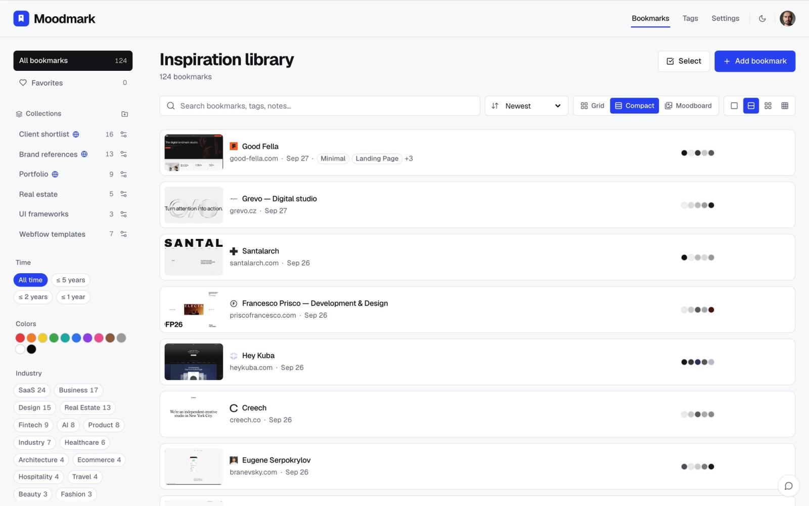
Why a single inspiration folder stops working
Most designers start their reference library the same way: one big folder, board, or bookmarks tab, growing forever. It works for the first fifty saves. Somewhere past a hundred it stops. You remember saving a great pricing page last month but you can't find it, because your folder is sorted by nothing more specific than 'cool sites.' The fix people usually reach for is more tags: 'minimal,' 'dark mode,' 'gradient,' 'bold typography.' Those tags describe the surface of a design, but they don't answer the question you actually have most often on client work: 'what do good fintech sites do with onboarding' or 'how do SaaS pricing pages usually lay out tiers.' That's an industry question, and a style tag can't answer it.
The problem with organizing by industry alone
The obvious fix is to flip it: sort everything by industry instead. That helps with the pattern question, but it creates a new problem. Inside 'SaaS' you'll eventually have two hundred sites, and you're back to scrolling. Industry narrows the field; it doesn't help you find the right look within that field. You still need a second axis, because the two questions designers ask are genuinely different: 'show me how this type of business usually solves this problem' and 'show me the one that looks like the mood I'm going for.' Industry answers the first. Color, style, and layout answer the second. A library that only supports one of them will always feel half-useful.
A practical system: broad buckets, then a visual filter
Start with 5 to 8 buckets, not twenty
The instinct is to get precise: 'B2B SaaS,' 'B2C SaaS,' 'vertical SaaS,' 'fintech neobank,' 'fintech infrastructure.' Resist it. Narrow categories fragment a small library into buckets with three sites each, which defeats the point of grouping. Start broad and only split a bucket once it's genuinely crowded (once 'SaaS' has 40+ saves, splitting into 'B2B SaaS' and 'consumer SaaS' starts to pay off). A workable starting set for most design work looks like this:
- SaaS / productivity tools
- E-commerce / D2C
- Fintech / banking
- Healthcare / wellness
- Marketplace / two-sided platforms
- Agency / portfolio / personal sites
That's six buckets, not sixty, and every save has an obvious home. If a site genuinely spans two (a fintech app with a strong marketplace angle), pick the one it competes with, not the one it technically is.
Layer a look-based filter on top
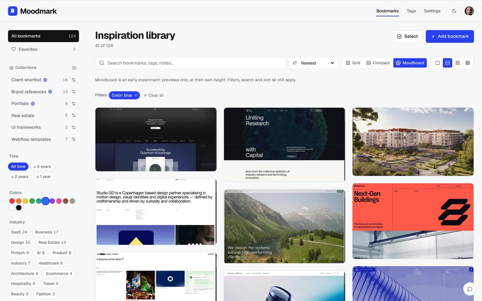
Once industry narrows the field, you need a second cut to get from 40 fintech sites down to the 3 that match the mood you're chasing. The fastest way to do that is by what the eye actually notices first: color and overall style (minimal, maximalist, editorial, brutalist, corporate). If your tool lets you filter a library by color palette, 'fintech + warm neutrals' or 'e-commerce + high contrast' turns a five-minute scroll into a five-second filter. This is the combination that actually works: industry gets you to the right category of problem-solving, color and style get you to the right mood inside it.
What to actually note inside each industry bucket
A screenshot alone loses most of the reason you saved it. When you drop a site into an industry bucket, spend ten seconds noting what it's actually a good example of. The pattern matters more than the industry label. Useful things to note per save:
- The specific pattern: pricing table layout, empty state, checkout flow, onboarding sequence, nav on scroll
- What problem it solves well: reduces choice overload, builds trust for a first-time payment, explains a complex feature in one screen
- What you'd steal vs. what you wouldn't: most references are good at one thing and mediocre elsewhere, so note the one thing
This turns 'fintech folder with 60 screenshots' into something you can actually search when a client asks for a specific solution, not just a specific look.
Common mistakes when sorting by industry
The most common one is treating industry as the only axis and skipping the visual filter entirely, which is what turns a bucket into its own unsearchable dump once it passes 30 or 40 sites. The second is being too precise too early: creating a 'healthtech B2B onboarding' bucket for a library that has four saves total is organizing for a library you don't have yet. The third is saving the site but not the reason. A screenshot of a beautiful checkout flow, six months later, tells you it was beautiful and nothing about why you thought so at the time. That context is the part that actually gets reused on a brief; the screenshot alone rarely is.
A smaller mistake worth naming: sorting by client industry instead of by the industry the design pattern actually came from. If you're designing a healthcare app but the best reference for its onboarding flow is a fintech app, file it under fintech, not healthcare. The point of the bucket is to find sites that solved the same problem well, not to mirror the brief you're currently working on.
A weekly habit that keeps it from rotting
Libraries decay the same way inboxes do: a burst of saving, then months of dumping things in unsorted because tagging feels like a chore in the moment. The fix isn't a bigger organizing session, it's a smaller recurring one. Once a week, spend five minutes doing three things: bucket anything saved that week into its industry, note the one pattern each save is worth keeping for, and delete anything that no longer earns its place (a site you saved for a trend that's already dated doesn't need to stay). Five minutes a week beats a two-hour cleanup every quarter, because the library stays usable the entire time instead of only right after you clean it.
Tools that make this workable
This system works in a spreadsheet if you're disciplined about it, but it's much faster with a tool built for it. Moodmark saves a site in one click from the browser (screenshot, color palette, and fonts captured automatically) and tags it by industry and style automatically, so the bucket a site belongs in isn't manual work you have to remember to do. From there you filter your library by industry and by color or style together, which is the two-axis system above without the spreadsheet. It's built for exactly this: designers and agencies who save references constantly and need to find the right one fast, not just the most recent one.
The takeaway
Industry and visual style solve two different problems, so a reference library needs both. Keep industry buckets broad, note the specific pattern each save is good for, filter by color or style to narrow within a bucket, and spend five minutes a week keeping it current instead of letting it pile up. That's a system you'll actually keep using six months from now, which is the only kind worth building.
Questions & answers
How many industry categories should a design reference library have?
Start with 5 to 8 broad categories like SaaS, e-commerce, fintech, healthcare, marketplace, and portfolio/agency. Only split a category further once it has enough saves (40+) that scrolling through it stops being fast.
Should I organize design inspiration by industry or by visual style?
Both, as two separate filters rather than one system. Industry narrows the field to sites solving the same kind of problem; visual style (color, layout, mood) narrows that field further to the ones that match the look you're after.
What's the fastest way to keep an inspiration library from becoming a dumping ground?
A short weekly pass beats occasional deep cleans. Spend five minutes sorting the week's new saves into industry buckets, note what pattern each one is good for, and delete anything that no longer earns its place.
