Why a visual audit beats a feature checklist
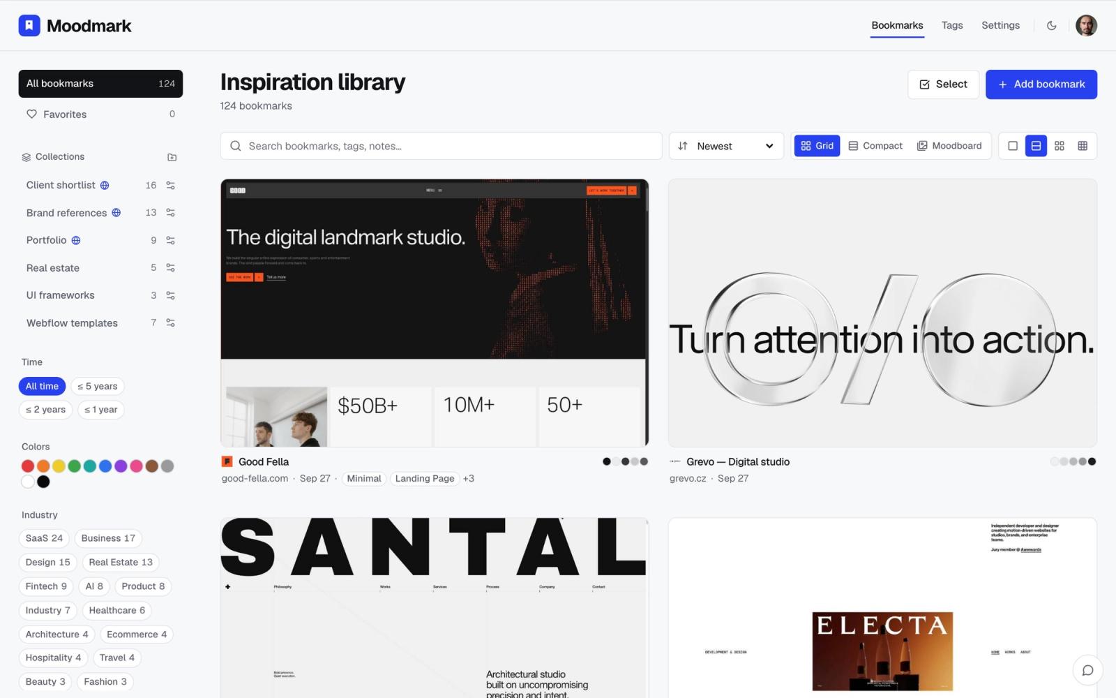
Most competitor research for a redesign turns into a spreadsheet: company name, pricing tier, feature list. That tells you what competitors say they do, not what their sites actually look and feel like, which is the part a redesign has to get right. A visual audit answers different questions. What color is this category defaulting to? Is everyone using the same hero layout? Does anyone look different, and does that difference work? You can't answer those from a feature matrix. You need the actual screenshots sitting next to each other.
This matters most in the first week of a redesign, before anyone has opened Figma. Walking into a kickoff call with 'here's what the category looks like, here's where it's crowded, here's the gap' is a far stronger opening than an opinion about whether competitor X's homepage is good.
Step 1: Build the list before you start saving
Split your list into two groups: direct competitors (same product, same buyer) and aspirational references (sites you'd want to look like, even outside the category). Five to eight in each is enough. Too few and you're guessing at what's typical; too many and the audit never gets finished. If you only have direct competitors, you'll end up redesigning toward the category average, which is rarely the goal.
Step 2: Capture, don't just browse
Opening 13 tabs and scrolling through them doesn't leave you with anything a week later. You need each site saved as an artifact you can come back to, with the things you'll actually compare already pulled out: a screenshot, the color palette, the fonts in use, and ideally what the site is built on. A one-click save (Moodmark's Chrome extension does this automatically) turns browsing into a library in the time it would've taken to bookmark the tabs anyway. Tag each save with the competitor's name as you go; you'll want to filter by it later.
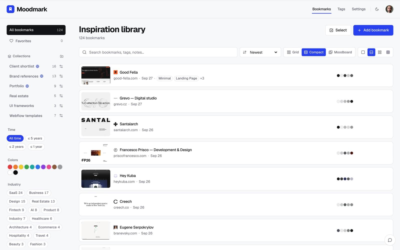
Step 3: Group by what you're deciding, not by company
A list of 13 competitors in alphabetical order doesn't show you anything. The audit becomes useful the moment you regroup the same sites by color, by layout, or by style and the pattern becomes visible on its own. Filter the library down to everything using a dark palette and you'll immediately see whether dark mode is becoming the category default or still the exception. Filter to warm, editorial palettes and you'll see which competitors are trying to differentiate on tone rather than on dark-mode-and-gradients.
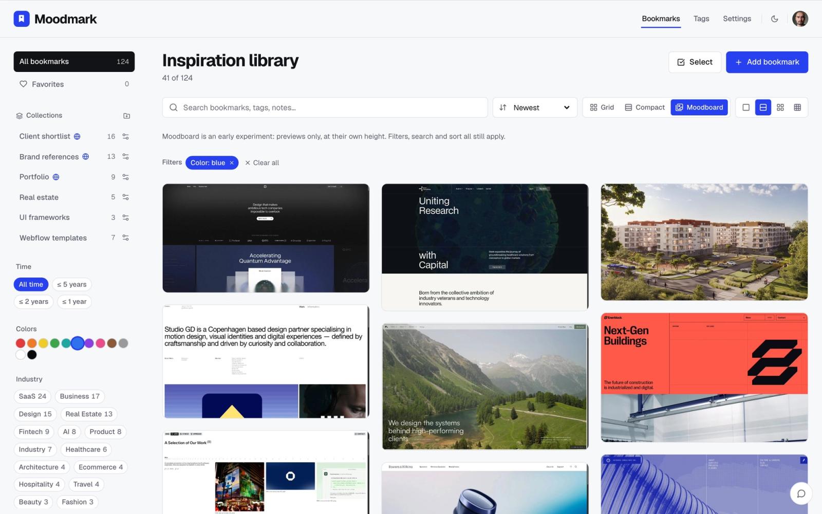
Step 4: Pull out the patterns worth naming
Hero sections
Look at the heroes side by side, grouped by layout. Count how many lead with a product screenshot versus an abstract illustration versus plain text on a color field. If nine out of eleven do the same thing, that's either a convention worth following because it's proven, or the exact thing worth breaking from because everyone looks the same. Name which one it is; don't leave it implicit.
Pricing pages
Pricing pages reveal more about a company's actual positioning than their homepage copy does. Note how many tiers competitors show, whether they anchor with a 'most popular' tier, and how they handle the free plan (a card with the same weight as paid tiers, versus a muted afterthought). This is also where you'll spot real strategy differences hiding under similar-looking hero sections.
Navigation and color usage
Is the category settling on a dark nav with a single bright accent color, or is everyone still running light and neutral? This is one of the fastest things to establish once sites are grouped by color rather than by name, and it directly informs a decision your designer will otherwise make on instinct in week three.
Step 5: Turn the audit into a direction, not a mood soup
The failure mode of competitor research is a Figma board with 40 random screenshots and no conclusion. Close the audit with three or four short statements your team can actually act on: 'the category defaults to dark, cool palettes, we're going warm and light to stand out', or 'nobody differentiates on the pricing page, that's an opening'. Each statement should point at the filtered group that proves it, so anyone joining later can see the evidence, not just the conclusion.
How long this should take
For a typical project, saving and tagging 10-15 sites takes under an hour once the list is settled. Grouping and pulling out patterns is another hour, maybe two if the category is crowded. That's half a day of work that replaces a much vaguer, longer back-and-forth in the first design review about what 'modern' or 'premium' is supposed to mean for this specific project.
Questions & answers
How many competitors should I include in a website redesign audit?
Five to eight direct competitors plus five to eight aspirational references is usually enough to see real patterns without the audit taking days. Fewer than that and you can't tell what's typical versus what's one company's quirk.
Should a competitor audit include non-competitor websites?
Yes. Direct competitors show you the category's defaults, but aspirational references (sites outside your category that you'd want to look like) show you where there's room to differentiate instead of just confirming the status quo.
What's the best way to organize competitor screenshots for a redesign?
Group them by what you're deciding, such as color palette or hero layout, rather than by company name. A tool that extracts palette and fonts automatically when you save a site, like Moodmark, makes this regrouping instant instead of a manual re-sort.
