
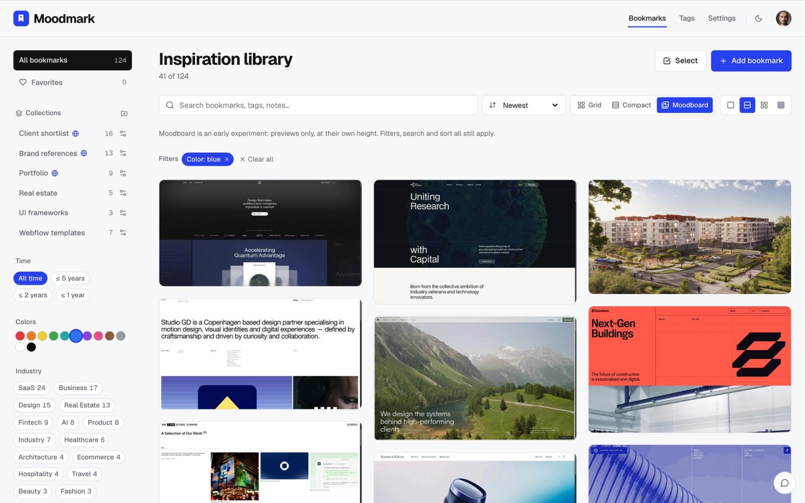
Most design inspiration tools let you filter by category — SaaS, portfolio, agency, e-commerce. Almost none let you filter by color, even though color is usually the first thing you remember about a reference. "That warm beige portfolio" or "the site with the deep green hero" is how references actually live in your head, not by their industry tag.
Why category search misses what you're actually looking for
Category describes what a site is for. Color describes what it looks like — and looks are what stick. When a client says "make it feel warm and premium, like that site we saw last month," they're not describing a business type. They're describing a palette, a mood, a set of visual decisions. Searching by category can't get you back to that memory. Searching by color can.
This is also why swipe-file-style moodboard apps built for consumer inspiration don't solve it either. Their feeds are optimized for browsing an endless stream, not for retrieving one specific thing you already decided was worth keeping.
The tools you already have, and where they run out
Dribbble and Behance color filters
Both let you filter shots by a color swatch, and it genuinely works — for their own content. The catch is scope: you're searching their public feed, not your own saved references, and you're looking at isolated shots rather than full sites with real layout and type decisions behind them.
Google Images' color filter
Google Images has a "color" filter with about a dozen preset buckets — red, orange, teal, and so on. It's fast but coarse: it can't tell you a hex value, and it's matching a dominant hue across the whole indexed web, not the specific reference you already liked and want to find again.
Adobe Color and Coolors
These are excellent for building or extracting a palette from a single image or URL. What they're not built for is search across a library — you feed them one reference at a time, and they don't hold a growing collection you can filter later.
Scrolling your own bookmarks
This is what most designers actually do, and it's the real bottleneck. A flat folder of thirty saved sites is fine to scroll. A folder of three hundred is not — and color is exactly the kind of memory that doesn't survive a folder full of generic filenames and tiny thumbnails.
The actual fix: index color the moment you save a reference
None of the tools above solve the real problem, which is that your own saved references — the ones you already decided were worth keeping — usually have no color data attached to them at all. The fix isn't a better search engine for other people's galleries. It's capturing the palette automatically when you save a site, so your own library becomes filterable the same way a color-searchable gallery would be.
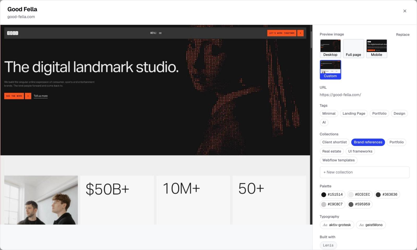
That's the mechanic behind Moodmark. The Chrome extension saves a site in one click and pulls the screenshot, the actual color palette, the fonts, and the tech stack at the same time — no manual tagging required. The app then lets you filter your library by those colors directly, the same way you'd filter by style or industry, so "that warm beige portfolio" becomes a two-click search instead of a scroll through a hundred thumbnails.
What filtering by color looks like in practice
Instead of a text search box, you're working with the actual palette: click a warm neutral swatch and the library narrows to references that share it. Stack that with an industry filter — warm neutral and SaaS look nothing like warm neutral and wellness — and you get a shortlist instead of a browse.
A workflow for building a color-searchable library
- Save the reference the moment you see it. A one-click extension beats a screenshot dumped into a folder you'll never revisit.
- Let the palette extract automatically. Manually tagging hex codes doesn't survive past a handful of saves.
- Add a mood or detail tag when color alone won't carry enough context later — tagging by mood and detail is worth doing alongside color, not instead of it.
- When a new project starts, filter by the client's brand color or the mood you're chasing, and pull matches from your library instead of re-Googling "warm minimal SaaS website."
- Pair color with industry or style so results stay relevant. The same warm palette reads completely differently on a fintech site than on a wellness one.
Where this actually pays off
Two moments this saves real time: when a client points at a competitor and says "like that, but warmer," and when you're matching a new design to a brand's existing palette. In both cases you're not trying to redescribe a color in words — you're filtering a library you already built.
And once you've narrowed down to the right reference, Moodmark can also turn it into a design.md brief with the extracted color and type tokens, ready to paste into v0, Cursor, Lovable, or Bolt. That's a useful bonus once the reference is already found — not the reason to start filtering by color in the first place. Try moodmark.design if a category-only inspiration tool has been slowing you down.
Questions & answers
Can I search Pinterest or Dribbble by color?
Dribbble and Behance support basic color filters for individual shots, and Google Images has a coarse color filter, but none of them can search across your own saved bookmarks — they only search their own public content.
Do I have to manually tag every reference's color myself?
No, not if your library extracts the palette automatically at save time. Manually tagging hex codes doesn't survive past a handful of saved references.
Does color filtering replace tagging by mood or industry?
No — combine them. Color narrows results fast; mood and industry tags add the why, which is why pairing filters, like warm plus fintech, works better than either alone.
